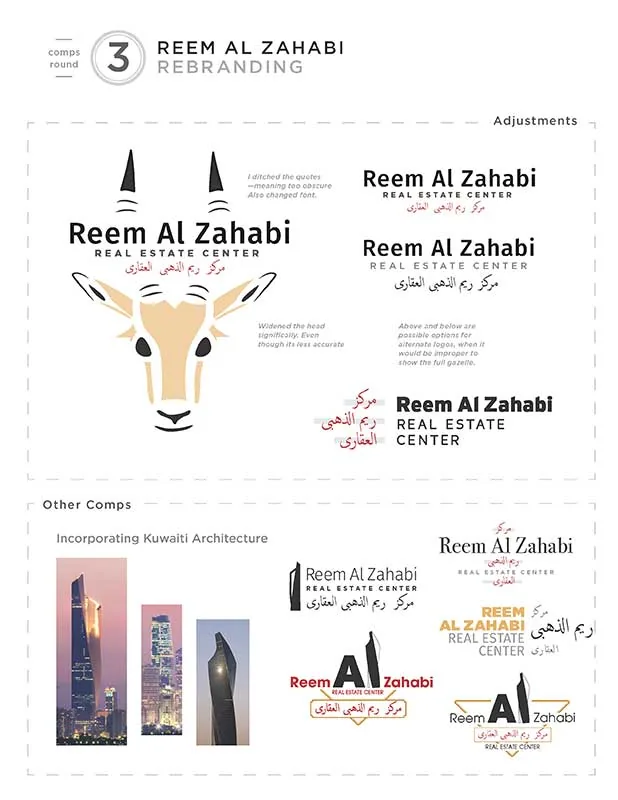
Kuwait is a small and wealthy country in the Arab Gulf. Its architecture is striking and memorable, and my first impulse was to incorporate it into the logo somehow. These comps of text alongside famous Kuwaiti buildings were not meant to be final (Reem Al Zahabi’s real estate business didn’t involve any of these buildings), but these were exercises I performed in order to find a good juxtapposition between the lettering and Kuwaiti architecture.
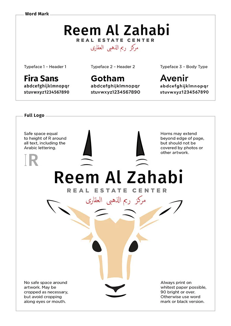
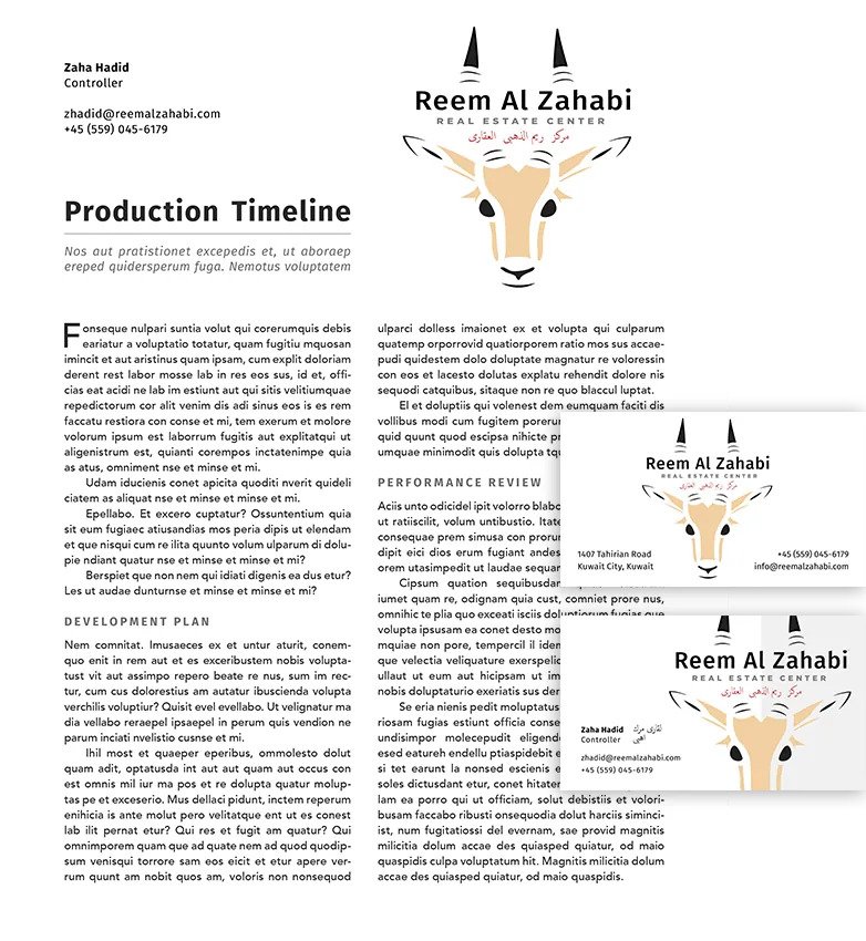
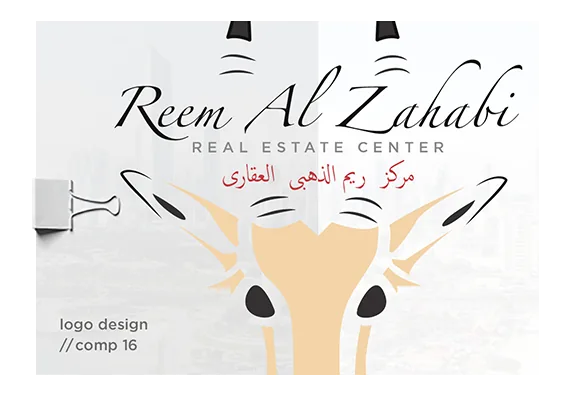
I eventually settled on Fira Sans. The slanted caps and eccentric styling of various letters, like the foot of the l and the tall lowercase i, are a great match for the skyline shown in behind this text.
For the gazelle illustration, I studied the facial features of gazelles and sketched them both freehand and with tracing paper. Their features, while pretty, didn’t quite fit the look that I wanted, so I exagerated some features, like the eyes and ears, and muted some others, like the mouth and horns.